 ThreeMatchBan
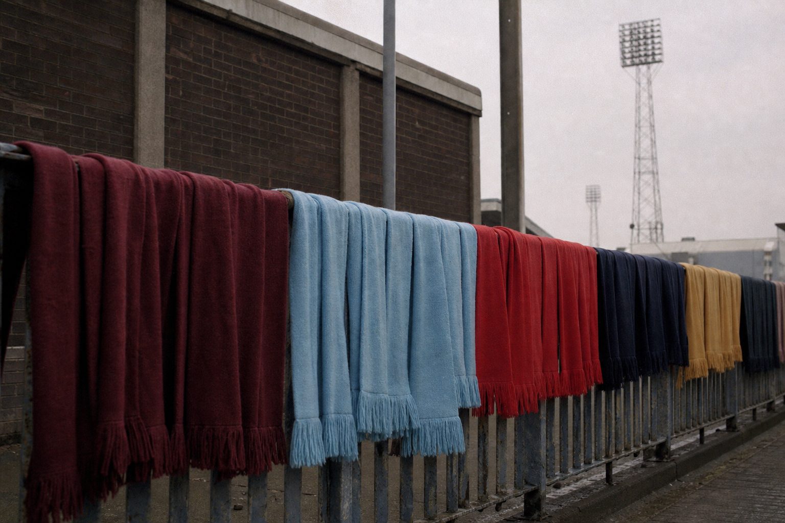
Football badges are the smallest part of a kit and the part supporters guard most fiercely. A shirt sponsor can change every summer without anyone marching on the club shop, but alter a lion's claws or drop a Latin motto and the petitions start within hours. The Premier League badges worn today look settled from the stands. Up close, nearly every one has been redrawn, rescued from a council coat of arms, put to a supporters' vote or quietly tidied up for the merchandise rail, and a few have done all four.
The 24 club histories collected here cover English top-flight regulars past and present, plus the two Glasgow giants. Each keeps to what can be shown: the season a crest first went on a shirt, the competition or consultation that produced it, and the symbols it carries. Where kit historians disagree about a date, the disagreement is flagged rather than settled by guesswork.
Premier League badges from Arsenal to Manchester United
The first half of the alphabet holds some of the oldest symbols in English football. Aston Villa's Scottish lion rampant first appeared in 1878 and has survived four redesigns since 2007, the last of them a return to the shield in 2024 after a single season with a round crest. Arsenal's cannon goes back to the Royal Arsenal at Woolwich, where the club was formed in 1886. It has pointed east and west at different times, and the 1949 crest carrying the motto "Victoria Concordia Crescit" stayed largely unchanged for 53 years before the 2002 redesign.
Chelsea date their lion to the Ted Drake era of 1952/53, partly drawn from the arms of the old Metropolitan Borough of Chelsea. Ken Bates replaced it in 1986 with a lion over the letters "CFC" so the club could copyright the design, and the older lion came back for the centenary. Everton's crest is built around Prince Rupert's Tower, the 1787 lock-up on Everton Brow, first drawn by club secretary Theo Kelly in 1938. Liverpool's liver bird was commissioned for the 1950 FA Cup final.
Manchester City made the most visible change in the set in 2016, swapping an eagle for a roundel with a ship, three rivers and a red rose. The long read on the evolution of Premier League club badges from Arsenal to Manchester United takes each of those clubs in turn.
Newcastle to Wolves: the other half of the club crests
Newcastle United have the newest design of the lot. The club announced it on 1 October 2026 after 27,348 supporters voted and Option C took 64.8%. It keeps the castle, the seahorses, the demi-lion and the pennon from the 1988 crest but redraws them more sharply, and it reaches the shirts in 2027/28. That is a big change for Tyneside: an earlier review had found 84% of fans wanted evolution, not an overhaul.
Nottingham Forest's tree came out of a 1973 Nottingham Evening Post competition, won by a Trent Polytechnic lecturer named David Lewis, because the club could not copyright the city arms it had been wearing. The tree went on the shirt in 1974 and later gained two stars for the European Cups of 1979 and 1980. Tottenham's cockerel has stood on a ball since 1909, when a copper figure went up on the West Stand at White Hart Lane; the badge was stripped back to the cockerel alone in 2006, then given a "remastered" identity in November 2024.
Wolves kept their geometric wolf head through a 2018 rebrand that rendered it as forged metal in three dimensions. West Ham United have gone furthest of all: a 2026 survey asked supporters whether the current crest should change, with any replacement planned for 2028. The companion piece on Premier League club badges from Newcastle United to Wolverhampton Wanderers covers the rest of that run.
Why clubs redesign their crests
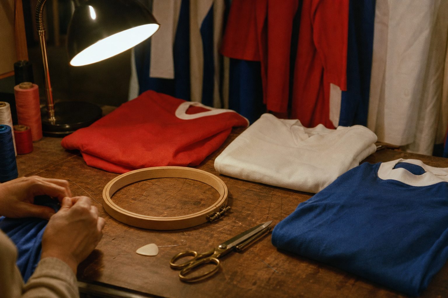
The most common reason is dull and legal. A club that wears its town's coat of arms does not own it. Forest found that out in 1973, Chelsea's 1986 badge existed so it could be copyrighted, and Fulham spent years with the arms of the London Borough of Hammersmith and Fulham on the shirt before switching in 2001 to a shield with black and white bars and a red linked "FFC". Research at the time suggested only 14% of people recognised the old one. Arsenal's 2002 change came partly because, according to kit historians, the 1949 crest could not be registered.
A new ground is the second trigger. Sunderland unveiled their current crest in July 1997 alongside the move from Roker Park to the Stadium of Light. Brighton's roundel, drawn by KSS, the architects of the Amex, arrived with the new stadium for 2011/12. West Ham launched theirs in 2016 to coincide with the move to the London Stadium, and Stoke City's 2001 shield was part of a wider rebrand after the club left the Victoria Ground for the Britannia Stadium in 1997.
Then there are birthdays. Southampton wore a one-season crest for their 125th anniversary in 2010/11, Arsenal added 15 oak and 15 laurel leaves for 2011/12, and Newcastle produced a gold and silver version for their 125th in 2017/18. These rarely last, which is part of their charm. A one-season badge is the quickest way to date a shirt on a charity-shop rail.
The newest driver is consultation itself. Arsenal have committed to the FA's Rule M, under which any material change to a crest needs supporter consultation, and almost every big redesign of the last decade has come with a vote attached.
The badges fans rejected, and what that history shows
Leeds United produced one of the fastest climbdowns in the history of club branding. On 24 January 2018 the club unveiled a crest called the "Leeds Salute", with no white rose on it. A petition against it passed 50,000 signatures the same day and later went beyond 77,000. The club backed away within days, invited supporters to send in their own designs, received around 1,200 of them and pushed any change back to 2019/20. In the end there was no new crest. The centenary season kept the existing shield, with "Leeds United 100 years" and 1919 in place of "LUFC".
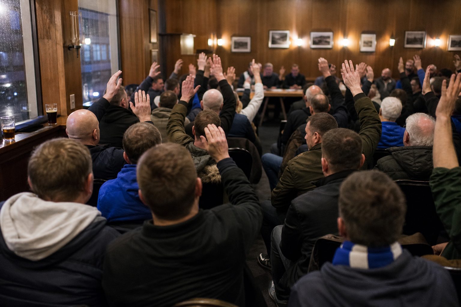
Everton's revolt five years earlier went further. The crest unveiled in May 2013 dropped the laurel wreaths and the motto "Nil Satis Nisi Optimum", nothing but the best is good enough. More than 21,000 people signed a petition. The club apologised and kept the design for 2013/14 only. A vote in October 2013, run by Electoral Reform Services with around 20,000 supporters consulted, chose a replacement by roughly 78%, and from 2014/15 the motto, the wreaths and the 1878 date were all back.
Aston Villa's roundel is the gentler case. Supporters picked the round design with 77% of the vote in November 2022 and it was worn in 2023/24, but by October 2023 the club was already reopening the consultation because the roundel "had not seen the anticipated commercial impact". The shield returned in 2024. Abroad, Juventus went the other way in January 2017 with a minimal "J" that dropped the charging bull and the crown, rode out the backlash and kept it.
What the symbols on football badges mean
Most football badges are local geography in miniature. Southampton's carries water for the docks and a tree for the New Forest. Forest's wavy lines are the River Trent, City's three diagonal stripes are the Irwell, the Medlock and the Irk, and Sunderland's quarters hold the Wearmouth Bridge and Penshaw Monument. Industry turns up just as often: Sheffield United's crossed blades come from the city's steel and cutlery trades, Stoke's bottle kiln from the Potteries, Sunderland's pit wheel from the Wearmouth Colliery on whose site the Stadium of Light now stands.
Heraldry supplies the rest. Lions sit on the crests of Villa, Chelsea and Rangers, though each arrived by a different route, while Newcastle's seahorses were added to the city arms in 1575. Short sentences in Latin survive at Everton, Tottenham and Sunderland. Shorter ones in English have come and gone: Villa wore "Prepared" until 2016, and Rangers have kept a single word, "Ready", on their scroll.
Club-by-club badge history: all 24 football team badges
Each of these football league badges has its own history below, following one crest from its first appearance to its current form, with a timeline of every change that can be pinned to a season. They run alphabetically. The two Glasgow clubs sit alongside the English ones because any honest collection of British football team badges would look odd without a lion rampant and a four-leaf clover.
- Arsenal badge: the cannon, the 1949 motto crest and the 2002 redesign.
- Aston Villa badge: a lion rampant since 1878, a European Cup star and a one-season roundel.
- AFC Bournemouth badge: the silhouette of Dickie Dowsett heading a ball.
- Brighton & Hove Albion badge: from twin town crests to the 2011 seagull roundel.
- Burnley badge: town arms, a 2010 scroll change and a one-colour crest from 2023.
- Celtic badge: the four-leaf clover of the east end of Glasgow.
- Chelsea badge: the lion, the "CFC" years and a refresh in 2026.
- Crystal Palace badge: an eagle above the glass palace, with 1861 in place of 1905 since 2022.
- Everton badge: Prince Rupert's Tower and the motto that came back.
- Fulham badge: council arms until 2001, then the "FFC" shield.
- Leeds United badge: the white rose shield and the 2018 U-turn.
- Liverpool badge: the liver bird, first commissioned for the 1950 FA Cup final.
- Man City badge: eagle out, ship and roundel in for 2016/17.
- Manchester United badge: one of the best-known crests in world football and one of the hardest to date.
- Newcastle United badge: seahorses, a castle and a new crest voted in 2026.
- Nottingham Forest badge: the competition-winning tree and two European Cup stars.
- Rangers badge: the lion rampant, the "Ready" scroll and the RFC monogram.
- Sheffield United badge: crossed blades and a white Yorkshire rose.
- Southampton badge: halo, tree, water and rose from a 1974 supporters' competition.
- Stoke City badge: the Staffordshire knot and bottle kiln, back for 2026/27.
- Sunderland badge: Penshaw Monument, the Wearmouth Bridge and a pit wheel.
- Tottenham Hotspur badge: a cockerel on a ball since 1909.
- West Ham United badge: crossed hammers, a lost castle and a possible new crest in 2028.
- Wolves badge: the geometric wolf head in old gold and black.
Collecting football league badges: dating a shirt by its crest
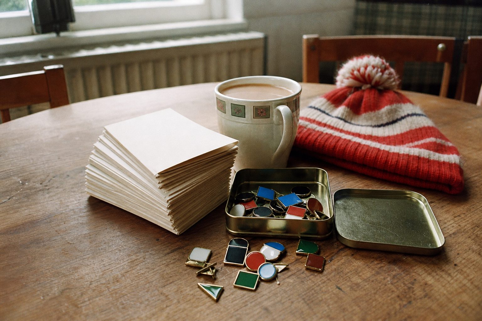
For anyone buying old kits, the crest is the cheapest dating tool there is. Football badges change less often than shirt designs, but when they do change, the shift is precise. A Villa shirt with a round crest can only come from 2023/24. A Chelsea shirt with a red lion over "CFC" points to 1987–95; the yellow version, to 1995–99. An Everton shirt without the wreaths is a 2013/14 piece, and a Leicester shirt reading "1884–2009" belongs to the 125th season alone.
The same logic works across the Premier League crests in reverse. Most Premier League badges can be read this way. If a supposedly 1990s Fulham top carries the barred "FFC" shield, it was made in 2001 or later, and a Brighton shirt with a gull facing the old way predates the Amex. Old football league badges, and football team badges of every era, reward that kind of attention to detail, which is why the most careful collectors spend longer on the chest than on the label.
Sometimes the oldest version wins. Stoke's 2026/27 crest is modelled on the knot and bottle kiln of 1977, Burnley's 2026/27 away shirt brings back the 1979 crest, and Newcastle's new design keeps every element of 1988. The most modern thing about several Premier League crests is the date on which they went backwards.