 ThreeMatchBan
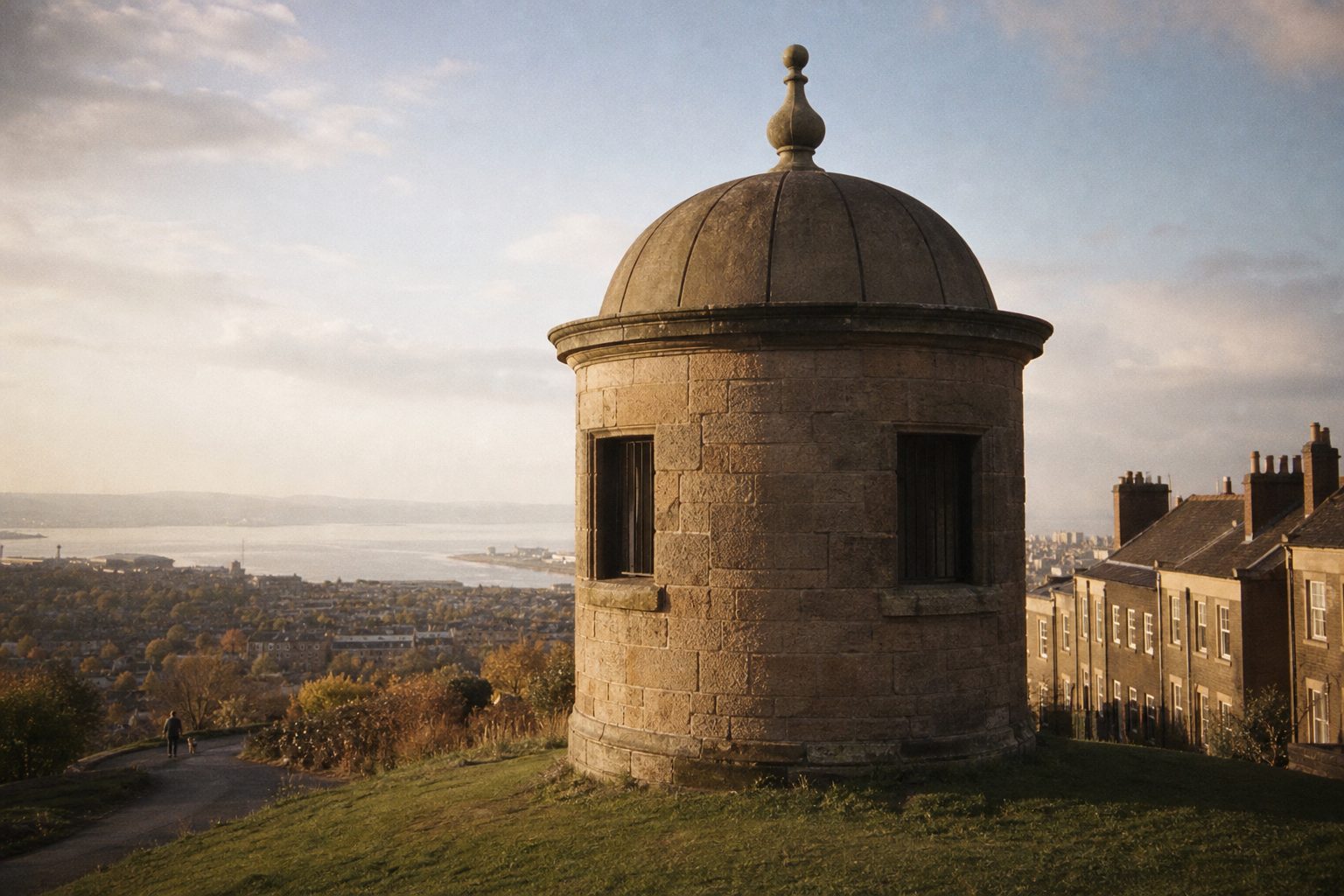
- 1787The Everton Lock-Up, later known as Prince Rupert's Tower, is built on Everton Brow.
- 1938Club secretary Theo Kelly designs a crest with the tower, two laurel wreaths and a Latin motto; it first appears on club ties in 1938/39.
- May 2013A new crest drops the wreaths and the motto Nil Satis Nisi Optimum; more than 21,000 supporters sign a petition and the club apologises.
- Oct 2013Supporters vote on a replacement in a consultation run by Electoral Reform Services; the winning design takes around 78 per cent.
- Jul 2014The revised crest is rolled out for 2014/15 with the motto, the wreaths and 1878 back, and the scroll fixed to the shield.
The Everton badge is built around a building, which is rare enough in English football to make it instantly recognisable. Prince Rupert's Tower, a squat round lock-up on Everton Brow, has sat at the centre of the Everton crest since 1938, flanked by two laurel wreaths and underlined by one of the best mottos in the game. It is also the badge behind one of the clearest examples of supporters overturning a redesign.
Prince Rupert's Tower: the old Everton badge of 1938
The crest was the work of Theo Kelly, the club secretary, in 1938. Kelly put the Everton Lock-Up at its heart: a bridewell, the old word for a village lock-up, built in 1787 on Everton Brow. Locally it was known as Prince Rupert's Tower, and the name stuck to the badge too.
Around the tower Kelly placed two laurel wreaths, the old symbol of victory, and beneath it the motto "Nil Satis Nisi Optimum": nothing but the best is good enough. The design first appeared on club ties in the 1938/39 season. That was the season Everton won the First Division, with Tommy Lawton leading the line, so the crest arrived at a fitting moment.
Its components have barely changed since. Tower, wreaths, motto and the blue and white colours were the elements fans thought of as the old Everton badge for the next three-quarters of a century, even as the lettering and the shape of the shield shifted around them.
The 2013 crest: the Everton badge fans rejected
In May 2013 Everton unveiled a new crest. It kept the tower but removed the laurel wreaths and, more controversially, the motto. The intention was a cleaner, more modern mark. The reaction was immediate and hostile.
More than 21,000 supporters signed a petition against it. The club apologised and announced that the new design would be used for the 2013/14 season only. For a Premier League club to reverse a rebrand within weeks of launching it was almost unheard of, and the episode is still cited whenever another club starts talking about refreshing its identity.
The objection was not really about style. A motto that says "nothing but the best is good enough" is a statement of intent, and removing it felt to many fans like removing the point of the badge. The wreaths mattered for similar reasons. A design can be modernised; a promise is harder to edit.
The fan vote and the 2014 crest
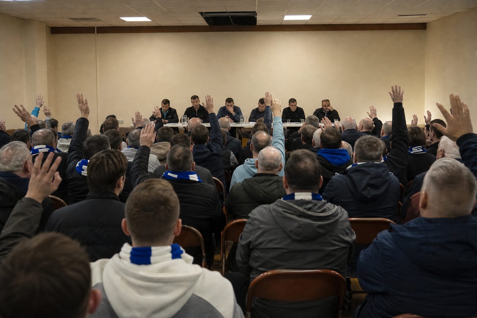
The consultation that followed was conducted on a scale few clubs had attempted. Around 20,000 supporters were involved, the vote was run independently by Electoral Reform Services and the candidate designs came from the agency Kenyon Fraser. When the result was announced in October 2013, the winning crest had taken roughly 78 per cent of the vote.
That design was rolled out in July 2014, in time for the 2014/15 season. The motto came back. So did the laurel wreaths, and the founding year 1878 returned, with the scroll now fixed to the shield rather than floating below it. It is, in effect, a tidier version of what Kelly drew in 1938.
Everton badge history at a glance
- Prince Rupert's Tower: the Everton Lock-Up of 1787 on Everton Brow.
- Laurel wreaths: two, a symbol of victory and success.
- Nil Satis Nisi Optimum: nothing but the best is good enough.
- 1878: the founding year, back on the crest since 2014.
- Colours: blue and white.
The Everton episode changed how clubs approach their crests. Arsenal now commit to supporter consultation on any material change, and the trend across the division has been toward fan votes rather than surprise launches. Across Stanley Park the story is different: the Liverpool badge has been shaped by cup finals and the Hillsborough memorial, and in 2012 a kit change angered some bereaved families who had not been consulted. Down the M62, Manchester United's devil took a different route again.
For the bigger picture of how civic and invented emblems evolved, the evolution of Premier League badges from Arsenal to Manchester United sets Everton alongside its neighbours, and the football badges section has every club history in one place.
The tower still stands on Everton Brow, in the district that gave the club its name. Few badges can be checked against the real thing on a short walk.