 ThreeMatchBan
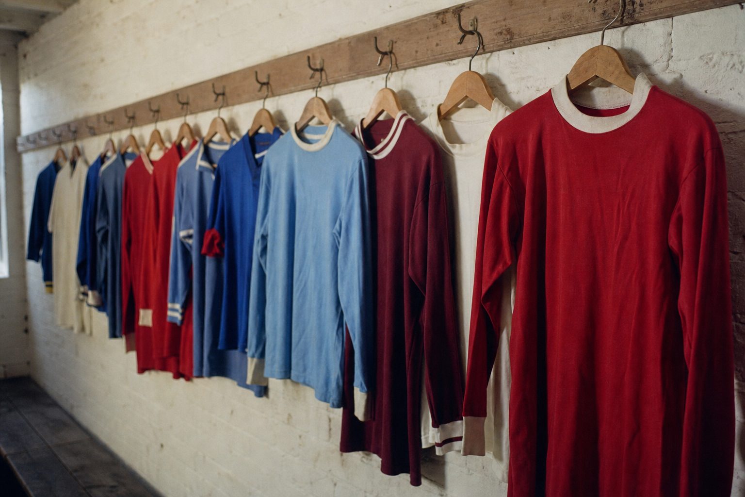
A club's badge is now inseparable from the club itself. It is printed on everything from shirts to mugs to bedding, and it appears in every television graphic. Yet Premier League badge history is shorter than most people assume. For long stretches of the twentieth century, teams were identified by their colours alone, and a crest on the shirt was a rarity, often reserved for the biggest occasion of all, the FA Cup final.
Over time the designs changed, and the pace picked up from the 1970s onwards as clubs realised that a badge borrowed from the local council could not be owned. A crest built on a public coat of arms was free for anyone to print, so one club after another replaced old football club badges with emblems they could copyright and sell. In the last fifteen years a third force arrived: supporters, demanding a say.
This is the first half of the evolution of Premier League badges, covering the clubs from Arsenal to Manchester United in alphabetical order. The second half runs from Newcastle United to Wolverhampton Wanderers., and every club with its own history page is listed in the football badges section.
The evolution of Premier League badges and the history behind them
Three themes run through the evolution of Premier League badges. The first is civic heraldry: towns and cities granted coats of arms, and clubs borrowed them, sometimes adding initials. The second is ownership, which explains most of the big redesigns between the 1970s and the early 2000s, and which turns the evolution of Premier League badges into a story about lawyers as much as artists. The third is consultation. Since the Everton row of 2013, clubs have learned that changing a badge without asking the people who wear it is a reliable way to start a fight.
The ten clubs below, each with its own chapter of Premier League badge history, were all in the top flight in the autumn of 2011. Blackburn Rovers and Bolton Wanderers have since dropped out of it, but their old badges belong in the story as much as anyone's.
Arsenal: a cannon that changed direction
Arsenal's cannon goes back to the club's roots among workers at the Royal Arsenal in Woolwich, where the club was formed in 1886. The gun first appeared in the matchday programme for the opening game of 1922/23, against Burnley, pointing east. Three seasons later, in 1925/26, it swung round to face west and gained the words "The Gunners".
The crest older Arsenal supporters grew up with arrived in 1949/50. It carried a gothic "Arsenal", the westward cannon, the arms of Islington, a band of ermine and the motto "Victoria Concordia Crescit", meaning victory grows out of harmony. That design stayed largely unchanged for 53 years, though it was first worn on the pitch only in 1990. It was cleaned up for 2001/02, with solid yellow replacing the gold, and replaced in 2002 by the current crest, introduced to embrace the future. Historical Football Kits notes that the old version could not be registered for copyright.
For the 125th anniversary in 2011/12 the club produced a one-off crest with 15 oak leaves, 15 laurel leaves, the dates 1886–2011 and its first motto, "Forward". Arsenal have since committed to the FA's Rule M, so any material change now needs supporter consultation.
Aston Villa: the lion that kept moving
Villa's Scottish lion rampant first appeared in 1878, and a crest first went on the shirts in 1956, in the years of the cup run that took the trophy to Villa Park in 1957. A new crest followed in 1973. In 2007 the badge was redesigned again: a small white star was added for the 1982 European Cup, won against Bayern Munich in Rotterdam, but the lion lost its claws.
The claws came back in 2016, when the English motto "Prepared" was dropped. Then came the most turbulent spell in the history of the crest. In November 2022 supporters voted 77 per cent to 23 per cent for a round design over a gas-lamp option, and the roundel was worn in 2023/24. It lasted one season. In October 2023 the club reopened consultation, saying the roundel "had not seen the anticipated commercial impact", and on 31 May 2024 it confirmed a new shield for 2024/25: a yellow lion on light blue with a claret and white outline, "1874", "ASTON VILLA" and the white star. Historical Football Kits called it remarkably similar to the earlier versions.
Blackburn Rovers: a rose that has barely changed
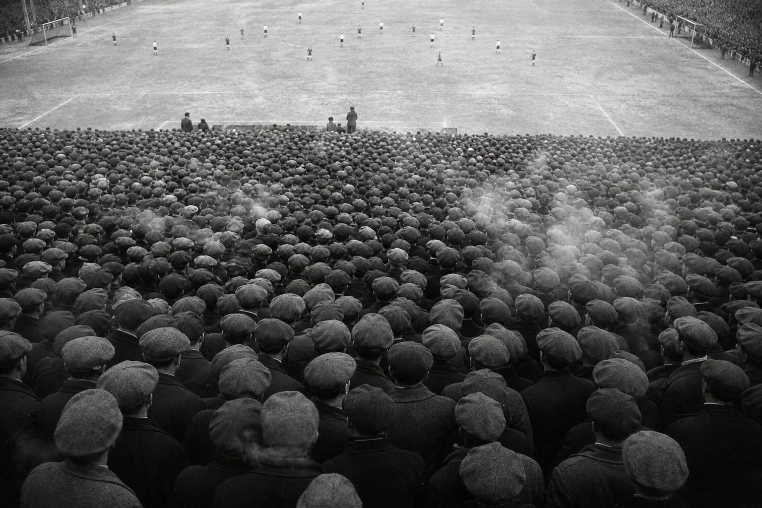
Blackburn's first shirt crest was the town's arms, worn only for the 1960 FA Cup final. The first badge worn outside a final came in 1974, a Lancashire rose with the club's initials. In 1989 the club adopted a far more distinctive version, which is still in use. The motto associated with Blackburn, "Arte et Labore", meaning by skill and labour, comes from the borough arms granted in 1852. For the club's 150th season in 2025/26, a special gold anniversary crest was placed on the back-neck label while the standard crest stayed on the chest.
Bolton Wanderers: the elephant and the rose
Bolton's first badge, from 1921, was a simplified version of the town arms, complete with the elephant that had been part of them since around 1799, and the town motto "Supera Moras", overcome delays. A redesign around 1951 kept the elephant and the castle, and it was recoloured in 1953. A modernist crest arrived in 1975 and lasted 26 years.
The ribbon crest that followed is dated differently by different sources: the club says it came after the move to the Reebok Stadium in 1997, while Historical Football Kits gives 2001. In June 2013, after consulting supporters, Bolton unveiled a crest that reworked the late-1970s design, brought back the Lancashire rose and added the founding year 1877. A year later the elephant returned on the Macron shirts after more than 40 years away, though not in the crest itself.
Chelsea: the Pensioner, the lion and the CFC
Before 1952 Chelsea had a crest depicting a Chelsea Pensioner, but it never reached the shirts. In 1952/53, under Ted Drake, a lion badge appeared, drawn partly from the arms of the Metropolitan Borough of Chelsea, and the club regards it as its first shirt badge. Historical Football Kits instead dates the first shirt crest to 1960, with a lion rampant from the arms of Earl Cadogan, the club's first president.
In 1986 Ken Bates introduced a lion standing over "CFC" so that the badge could be copyrighted. It was red from 1987 to 1995 and yellow from 1995 to 1999. For the centenary in 2005/06 Chelsea went back to the lion design of the 1950s and 1960, and in June 2026 that crest was refreshed with a deeper blue, no gold outlines and a flat, unshaded lion.
Everton: the tower and the motto fans saved
Club secretary Theo Kelly designed Everton's crest in 1938, placing Prince Rupert's Tower, the Everton Lock-Up built in 1787, between two laurel wreaths above the motto "Nil Satis Nisi Optimum": nothing but the best is good enough. It first appeared on club ties in 1938/39.
In May 2013 a new crest dropped the wreaths and the motto. More than 21,000 supporters signed a petition, the club apologised and the design was used for 2013/14 only. A vote run by Electoral Reform Services, with around 20,000 fans consulted, chose a replacement with about 78 per cent support, and in July 2014 the revised crest brought back the motto, the wreaths and 1878.
Fulham: old badges out, a monogram in
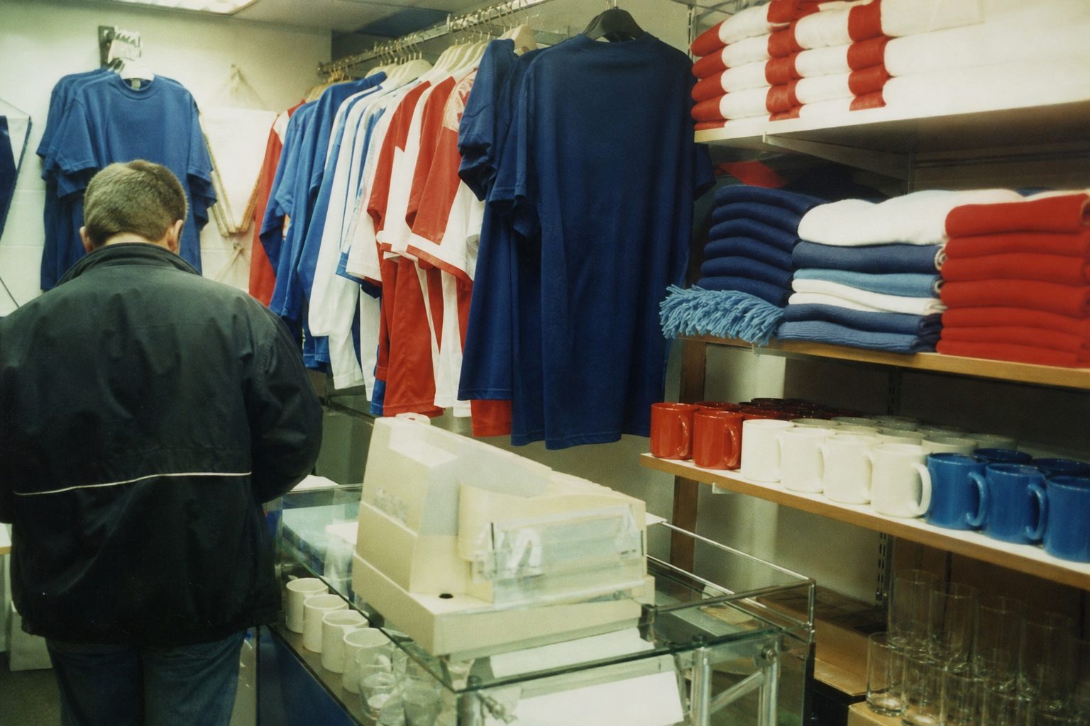
Fulham's old badges were built on the arms of the London Borough of Hammersmith and Fulham, which the club could not own or trademark. In May 2001, ahead of the first Premier League season, the club introduced a shield of black and white bars with a red, linked "FFC". Research at the time suggested only 14 per cent of people recognised the old crest. The new one was criticised at launch, yet it is still on the shirt a quarter of a century later.
Liverpool: the liver bird
The liver bird is the symbol of the city of Liverpool, and the club first wore it for the 1950 FA Cup final, a crest commissioned for the occasion with the bird on a red shield. Arsenal won that final 2–0. From November 1955 the bird appeared on the home shirt inside an oval emblem.
The Hillsborough memorial flames later became part of the crest. When Warrior took over the kit for 2012/13, the shirt carried a simple liver bird with "LFC", and the flames and the number 96 moved to the back of the shirt. Some bereaved families were angered by the lack of consultation. The memorial now honours 97 victims.
Manchester City: from roundel to eagle and back
City wore round badges from 1970 until 1997. That year brought an eagle crest with three stars and the motto "Superbia in Proelio", pride in battle. It lasted almost two decades, until supporters made clear they wanted a round badge back.
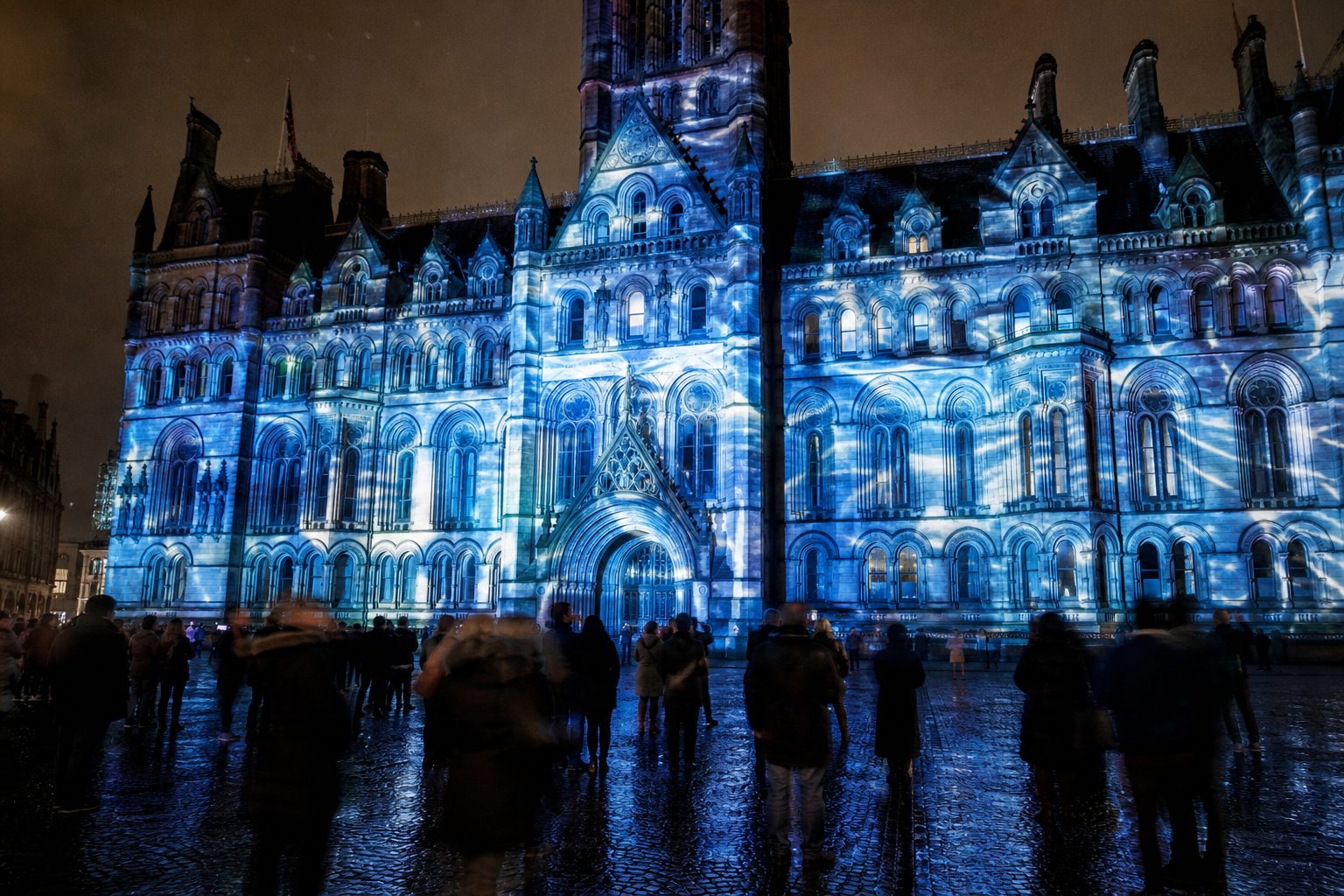
A 30-day consultation ran in October and November 2015, and the new roundel was shown to fans before the Boxing Day game against Sunderland. It was launched for 2016/17 with a projection on Manchester Town Hall. Every element came from the consultation: the ship, chosen by 85 per cent of fans for the city's trade links; the three rivers Irwell, Medlock and Irk at 67 per cent; the red rose at 60 per cent; and the founding year 1894, on the badge for the first time.
Manchester United: the ship and the devil
United's crest pairs a sailing ship, the same Manchester trading symbol that City adopted in 2016, with a devil holding a trident, drawn from the nickname the Red Devils. Two scrolls carry the words "Manchester" and "United". The dates of the earlier versions are disputed between sources, and the club has not published its own sequence, so they are best left open here.
The club was founded in 1878 as Newton Heath and became Manchester United in 1902, so nothing on the crest refers to its railway origins. What makes the design unusual among old football club badges is the balance it strikes: the ship ties Manchester United to the city, while the devil is a symbol no council could claim. That second element gave the club something it owned outright, the very thing Chelsea, Fulham and Arsenal had to redesign their crests to get.