 ThreeMatchBan
- 1970A circular crest, used on club stationery through the 1960s, first appears on the shirts in October 1970.
- 1997Eagle crest with three stars and the motto Superbia in Proelio.
- 2015A 30-day fan consultation runs through October and November.
- 2015New roundel shown on 26 December, before the Boxing Day game against Sunderland.
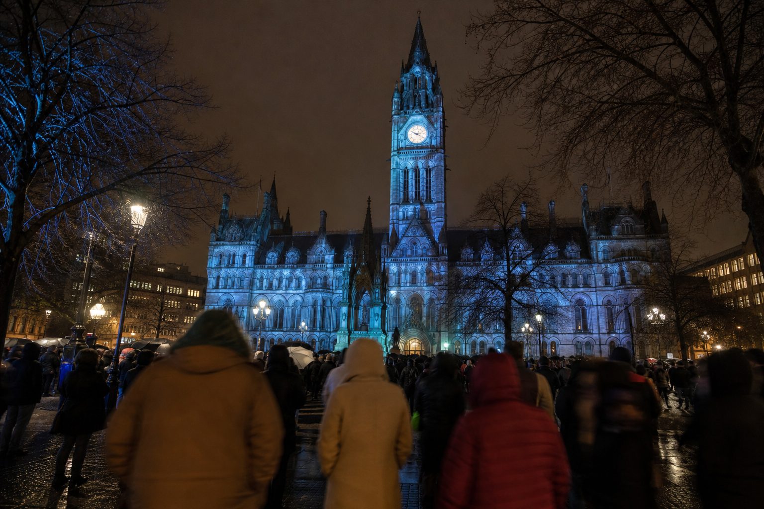
- 2016Roundel launched for 2016/17 with ship, three rivers, red rose and 1894; projected onto Manchester Town Hall.
The new Man City badge is not all that new any more. The roundel first shown to supporters on Boxing Day 2015, and worn from the 2016/17 season, has now been on the shirt for ten full seasons. Yet it still reads like a correction. It returned City to the round shape of the badges the club had worn before 1997, after almost two decades in which the chest carried an eagle, three stars and a Latin motto. Supporters were asked what they wanted, and they mostly asked for the past.
The story of the Manchester City badge since the 1990s is short, but it covers two very different clubs: the one that adopted the eagle in 1997 and the one that put it away in 2016.
The new Man City badge of 2016
The process started with a 30-day consultation in October and November 2015. The results were unusually specific. Asked which elements a new crest should keep or bring back, 85% of fans wanted the Manchester ship, 67% wanted the three rivers, and 60% wanted the red rose of Lancashire. On colour the answer was almost unanimous: 94% for blue, 68% for white. The order of events mattered. Two years earlier Everton had unveiled a new crest first and asked questions afterwards, then spent a season apologising for it. City reversed the sequence: ask first, draw second, show the result only once the answers were in. Many respondents also asked for the round shape of the older badges.
The design that came out of that exercise was shown on 26 December 2015, before the Boxing Day game against Sunderland. It then waited half a year. The full launch came in summer 2016, for the 2016/17 season, when the badge was projected onto Manchester Town Hall, a fitting choice for a crest built so heavily on civic symbols.
One addition was new to any City crest: the year 1894, when the club took the name Manchester City. It had never been on the badge before 2016.
The same route, a consultation followed by a roundel, went very differently in Birmingham. The Aston Villa badge went round in 2023 and back to a shield a year later. City's version has stuck, and the reasons are in the detail: the 2016 roundel was not a new idea dressed up as heritage but a fairly direct return to shapes and symbols fans already knew.
Old Man City badges: the round years and the eagle
From 1970 to 1997, City's shirt badges were mostly round, apart from a spell between 1976 and 1981 when the Manchester coat of arms was used. Their details changed over those decades, but the circle stayed, and it was the circle supporters asked for again in 2015. Older fans had grown up with it at Maine Road.
The eagle crest arrived in 1997. It was built around an eagle, with three stars and a scroll carrying "Superbia in Proelio", Latin for "Pride in Battle". The timing is part of its legend. City had been relegated from the Premier League in 1996 and dropped into the third tier in 1998, so the old Man City badge with the eagle first appeared on a side heading the wrong way.
It then stayed on the shirt through the climb back. The eagle was on the chest at Wembley for the 2011 FA Cup final, for the first league title in 44 years in 2012, sealed by the stoppage-time winner against Queens Park Rangers, and for the 2014 title. When the club decided to commission a new Man City badge, it was not replacing a crest of failure. It was replacing one that a whole generation of fans had never known City without.
The motto went with it. "Superbia in Proelio" appears only on the 1997–2016 crest and is not part of the current design.
Manchester City badge history by decade
A compressed Man City badge history runs like this. The club began as St Mark's (West Gorton) in 1880, became Ardwick in 1887 and was reorganised as Manchester City in 1894, the date now printed on the crest.
In October 1970 a round badge, already used on club stationery through the 1960s, went on the shirts for the first time. City moved to Maine Road in 1923, and the title of 1937, the 1950s cup finals and the Joe Mercer and Malcolm Allison side that won the league in 1968 and the European Cup Winners' Cup in 1970 all came before the round badge first appeared on the shirts.
1997 brought the eagle, carried through the lowest point of the club's modern history and the 2003 move from Maine Road to the City of Manchester Stadium. 2015 brought the consultation, and 2016 the roundel that every Manchester City badge since has followed.
Across the city, the Manchester United badge has followed a very different path. The Boxing Day opponents of 2015 have a crest story of their own, too; the Sunderland badge was also redesigned in 1997.

Badge details explained: what the crest shows
Every element on the current crest was chosen because supporters asked for it. Taken one by one:
- The ship: Manchester's trading links, the most popular element in the consultation at 85%.
- The three rivers: the Irwell, the Medlock and the Irk, drawn as diagonal stripes. The Irwell is the one that divides Manchester from Salford.
- The red rose: Lancashire, the historic county.
- 1894: the year Manchester City took its name, on the badge for the first time.
- Colours: blue and white, backed by 94% and 68% of fans, with the red of the rose.
Missing from the list are the eagle, the stars and the motto. The 2016 crest is the plainest Man City badge in decades, and that plainness was deliberate: a badge that could sit on a shirt, a stadium wall or a phone screen without needing the explanation the eagle often required.
For the wider picture, the evolution of Premier League club badges from Arsenal to Manchester United puts City alongside their neighbours in the alphabet and gives the full Man City badge history its context, and the football badges hub lists every club history. The first match the roundel was worn in competitively, in August 2016, was Pep Guardiola's first Premier League game in charge.