 ThreeMatchBan
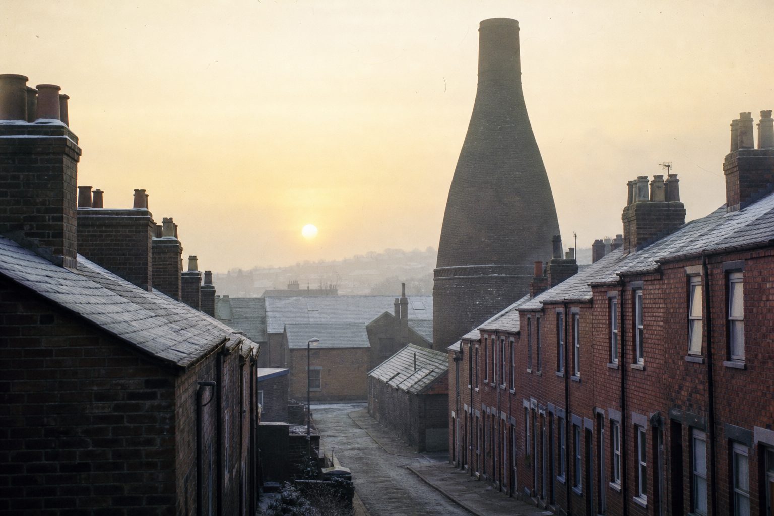
- 1977Badge with the Staffordshire knot and a bottle kiln, worn until 1992 and long a supporters' favourite.
- 1992A badge based on the town arms replaces it, in use until 2001.
- 2001Simplified shield with red and white stripes, The Potters, 1863 and S.C.F.C., part of a rebrand after the 1997 move to the Britannia Stadium.
- 2026New crest based on the 1977–92 design debuts on the 2026/27 home kit in June.
- 2026The new badge is installed at the bet365 Stadium in a phased rollout.
Some badges improve with age; the old Stoke badge simply waited. The 1977 design, with a Staffordshire knot and a bottle kiln, was dropped in 1992, and for a generation afterwards the shirts carried something plainer. In June 2026 it came back. Stoke City's new crest, based on the 1977–92 original, made its debut on the 2026/27 home kit, and it is now going up around the bet365 Stadium as well.
The Stoke badge history is short, with four main versions in fifty years, but each one says something about how the club saw itself at the time.
1977: the Stoke crest fans never forgot
The 1977 badge put two local symbols together. The Staffordshire knot is the county emblem, a looped knot that appears across Staffordshire on everything from council signs to pub names. The bottle kiln is the shape of the Potteries themselves: the brick ovens in which Stoke-on-Trent fired its pottery, and the reason the club is known as the Potters. Between them, the two symbols needed no explanation anywhere in the city.
It was worn from 1977 to 1992, through relegations and promotions, and by the time it went it had become a favourite with supporters. Badge-history writers still describe it that way.
Town arms, 1992 to 2001
In 1992 the club replaced the knot and kiln with a badge based on the arms of the town. It was a more formal, heraldic design, of the kind many clubs had used before modern crests existed, and it lasted until 2001. In Stoke badge history it is the version that tends to be skipped over: neither the cult original nor the badge of the modern era.

The 2001 shield and the Britannia years
Stoke left the Victoria Ground in 1997 for the new Britannia Stadium, and a wider rebrand followed. The 2001 crest was a simplified shield with red and white stripes, the words "The Potters", the date 1863 and the letters "S.C.F.C.". It was clean and easy to reproduce, and it carried Stoke through the most successful period in their modern history: promotion to the Premier League in 2008, a decade in the top flight and the 2011 FA Cup final, lost 1–0 to Manchester City.
It also lacked almost everything that had made the 1977 badge distinctive. There was no knot and no kiln. The stripes and the nickname did the work instead.
Moving grounds and changing badges often go together. The West Ham badge lost its castle for the move to the London Stadium in 2016, and in both cases the new crest ended up being measured against the old one.
2026: the old Stoke badge returns
The new crest for 2026/27 is built on the 1977–92 design. The knot and the bottle kiln are back, with red and white stripes and the founding year. It debuted on the Macron home kit released in June 2026, and the badge is being installed at the bet365 Stadium in phases, one of the more visible changes to the ground in recent years, though not every supporter was convinced by how it looks on the stadium.
The return of an old design is part of a wider pattern. Burnley's 2026/27 away kit brought back their 1979 crest, and the Burnley badge history shows the same pull towards the 1970s and 1980s. Few clubs, though, have gone as far as Stoke and made the old badge the main crest again.
The founding-year question
One detail on every modern Stoke crest invites argument: the date. The club uses 1863, which would make it one of the oldest professional clubs in the world, but the year is disputed and some historians argue for 1868. The crest has kept 1863 regardless.
For comparison, the Sheffield United badge builds its identity on the same kind of local industry, with crossed blades for steel, and puts a far less contested date, 1889, at the bottom. The full list of club histories is on the football badges hub, with the wider story of the clubs from Newcastle onwards in the evolution of Premier League club badges from Newcastle United to Wolverhampton Wanderers. More on the club is collected under Stoke City. Somewhere in the city, a bottle kiln still stands.