 ThreeMatchBan
- 1872Rangers founded by a group of young men playing on Glasgow Green.
- 1899The present Ibrox Park opens in Govan.
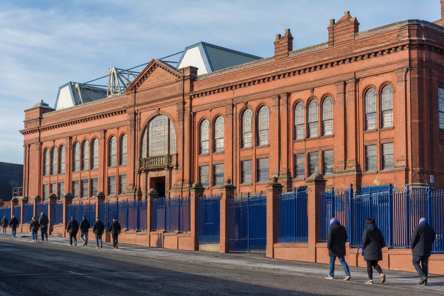
- 1928Archibald Leitch's red-brick main stand opens at Ibrox.
- TodayThe lion rampant, the Ready scroll and the RFC monogram remain the club's core symbols.
Walk down Edmiston Drive in Govan and the first thing Ibrox shows a visitor is red brick, not a badge. The long main stand facade, designed by Archibald Leitch and opened in 1929, does most of the talking. But look at the gates, the club shop windows and the blue shirts heading for the turnstiles, and the Rangers badge appears again and again in three forms that have come to mean the same club: a lion rampant, a scroll with the word "Ready", and the interlocking letters RFC.
The Rangers crest is a good example of how far a small set of symbols can go. Its story is less about dramatic replacements than about the same few elements being combined, redrawn and recombined.
1872 and a club that grew into its symbols
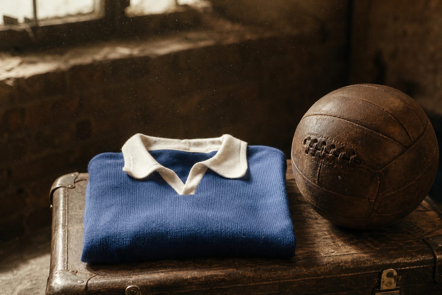
Rangers were founded in 1872 by a group of young men who had been playing on Glasgow Green. The club moved through several grounds before settling at Ibrox, and the current Ibrox Park opened on its present site in 1899. That is a long time to go without the kind of formal crest a modern club takes for granted, and for much of the early period a team was identified by the colour of its jersey more than by anything stitched on it. For Rangers that colour was royal blue, and the nickname that followed was "the Light Blues", later joined by "the Gers".
When the badge did develop, it reached for national symbols rather than local ones. That makes it different from Sunderland's bridge or Southampton's tree. The Rangers badge is about Scotland first and Glasgow second.
The lion rampant on the Rangers crest
The lion rampant is one of the oldest images in Scottish heraldry still in everyday use: a lion standing on its hind legs, forepaws raised, claws out. It sits on the Royal Banner of Scotland and has long been carried as an unofficial national flag at football grounds and sporting events. Placing it at the heart of a club crest makes a plain statement of identity.
The same beast turns up south of the border. Aston Villa have carried a Scottish lion rampant since 1878, and the Aston Villa badge spent the years from 2007 to 2016 with a clawless version that supporters disliked so much the claws were eventually put back. Chelsea's lion arrived through borough heraldry instead. Rangers' lion, by contrast, has never needed explaining to anyone in Scotland.
Across the city, the club with which Rangers share Glasgow's oldest rivalry took a completely different route. The Celtic badge is built around a four-leaf clover, so the two crests of the Old Firm draw on entirely separate traditions.
"Ready": a motto of one word
Many British crests carry a motto, usually in Latin and usually long. Everton have "Nil Satis Nisi Optimum", Tottenham "Audere est Facere", Sunderland "Consectatio Excellentiae". Rangers settled for one English word on a scroll: "Ready".
It works because it is so short. There is nothing to translate and nothing to mispronounce, and it reads equally well on a stadium gate, a pin badge or a supporters' club banner. The only real comparison in this collection is Aston Villa's "Prepared", another single English word, which Villa dropped in 2016. Rangers kept theirs, and the scroll remains one of the most recognisable parts of the old Rangers badge and the modern one alike.
The RFC monogram
The third element is the simplest. R, F and C, for Rangers Football Club, interlocked into a single monogram. Monograms were common on football shirts through much of the twentieth century because they were cheap to stitch and easy to read from the terraces, and many clubs abandoned them for full heraldic crests later on. Rangers never let theirs go. Since 1968 the monogram has been the badge on the shirt, while the lion rampant crest has served as the club's official emblem on documents and merchandise, and both remain instantly linked with the club.
That dual identity is unusual. Most clubs choose one mark and retire the other; Tottenham's revival of a 1950s THFC monogram in their 2024 identity is one of the few comparable cases in Britain. For collectors, it also makes Rangers badge history slightly harder to pin down than that of an English club with a single, regularly redrawn crest.
Reading an old Rangers badge
Because the Rangers crest has evolved by rearrangement rather than replacement, dating an old Rangers badge, pin or scarf depends on which elements appear together and how they are drawn rather than on any single dramatic change. The lion, the scroll and the letters have been constant; their combination, proportions and lettering have shifted over time. That makes the crest harder to date than Villa's or City's, but it also means a supporter from almost any decade would recognise the current design at once.
Rangers were also part of the British title picture in a golden age of black-and-white football, and turn up among the English, Scottish and Irish champions of 1958–59 alongside Wolves. The rest of the club histories sit on the football badges hub, and the English sides from Newcastle onwards are covered in the evolution of Premier League club badges from Newcastle United to Wolverhampton Wanderers. Of all the crests in that run, the Rangers one carries the shortest motto by some distance.