 ThreeMatchBan
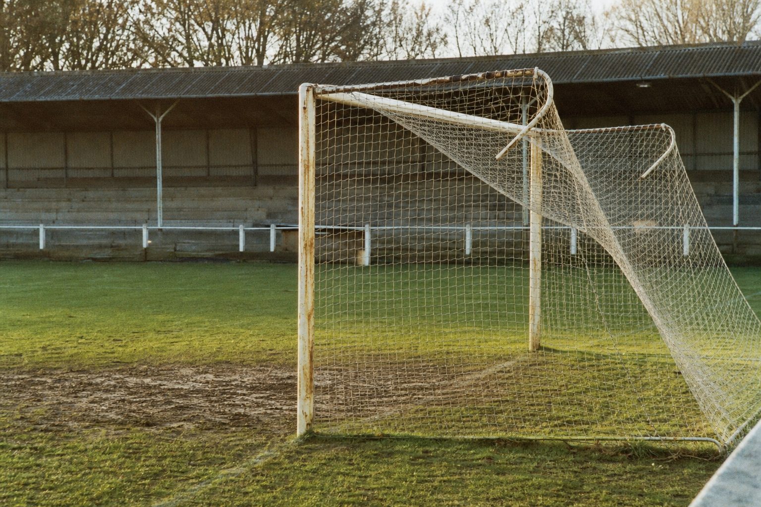
Football in the 2010s looked very different to football twenty years earlier. Not the big shifts, the television deals, the agents and the money pouring in from every corner of the globe. The small things. The parts of the game that catch a child's eye before anyone has explained what a broadcasting contract is.
Those surface changes belong to the same process that turned the sport into a luxury product. David Silva running rings round a Newcastle defence at the start of 2013–14 and the employment laws of the Gulf state that bankrolled Manchester City's rise are, in the end, two sides of one coin, even if one side shines rather more. The game went from something found on a shelf between extension cables and spark plugs in a Bolton DIY shop, circa 1989, to a West End package costing a second mortgage. Here are some of the most visible signs.
Square nets
There was a time when goal nets were left to droop from the posts in a soft triangle that billowed when the ball hit them. It was one of the great images of the game, as recognisable as the ball itself.
Those loose drapes are gone from the top level now. The modern goal is all right angles: the net stretched back to a box frame on metal supports, tight as a tennis court. The old style survives on parks pitches and in the lower divisions, which may explain why the high end of the game turned its back on it. The change gathered pace after the 1994 World Cup in the United States, one of several American touches that seeped into the domestic game in that decade, and the triangles were all but gone from the top flight by the time Leicester City left Filbert Street in 2002.
Below the Football League the square frames keep spreading too. Even modest non-league grounds in north London have the nets standing to attention on iron gallows behind the goal. The few clubs that hold on to the old look, Walsall at the Bescot among them in 2013, now seem like they are clinging to the past rather than simply living in it.

Names on the backs of shirts
Squad numbers and players' surnames arrived in the Premier League for the 1993–94 season, a borrowing from American sport. The lettering at first was so thick it looked as if it added weight to the shirt.
Looking back, it was an early step in moving the focus from the team to the individual. The cult of personality that the Premier League now trades on can be traced to that moment of permanent self-promotion. Like the square nets, the names added nothing to the football. They were one more thing to look at, and the league and its broadcasters have been adding to that list ever since. Anyone who grew up on plain numbered shirts will enjoy guessing teams from their classic kits, and the guide to the 2012–13 Premier League kits shows where design had got to a season earlier.
Coloured boots
Clubs and manufacturers spend fortunes on shirt designs, some more successfully than others; Stoke City's away kit of 2013–14 divided opinion sharply. It seems odd, then, to let players finish the outfit with footwear that glows like a highlighter pen.
There was a time when a pair of white boots on an English pitch made crowds murmur at the sheer showiness of it. Alan Ball wore them for Everton in the early 1970s and it was news. These days black boots are the eccentric choice.
White at least goes with anything. If Yeovil Town are playing Blackpool, the green and tangerine clash is calmed by a neutral boot. When Gillingham's goalkeeper Stuart Nelson stepped out in an all-red kit with neon green boots in 2013, the effect was less calming. The Nike Mercurial Vapor review is a reminder of how quickly the bright stuff became normal.
Pitch patterns
Are groundsmen trying to tell the public something in code? Stripes were once the height of sophistication. Now there are chequerboards, diagonals, circles and diamonds, mown with a precision that would impress a code-breaker at Bletchley Park.
A trip to Molineux in August 2013 made the point. The weave cut into the grass seemed to be hiding a secret so carefully that even the man with the keys to the mower could not have explained it.
The argument about all this has a long tail among football writers. Plenty of it lives on a personal blog or two, and much more of it plays out every week on Twitter, where old photographs of drooping nets still get shared with real affection. Amateur photographers keep a record of grounds as they change, and collections such as Flickr / laffy4k are worth a browse for anyone who misses the old details.
None of it changes the result. But anyone who saw a ball nestle into a sagging net at Filbert Street knows the square frame is a downgrade.